
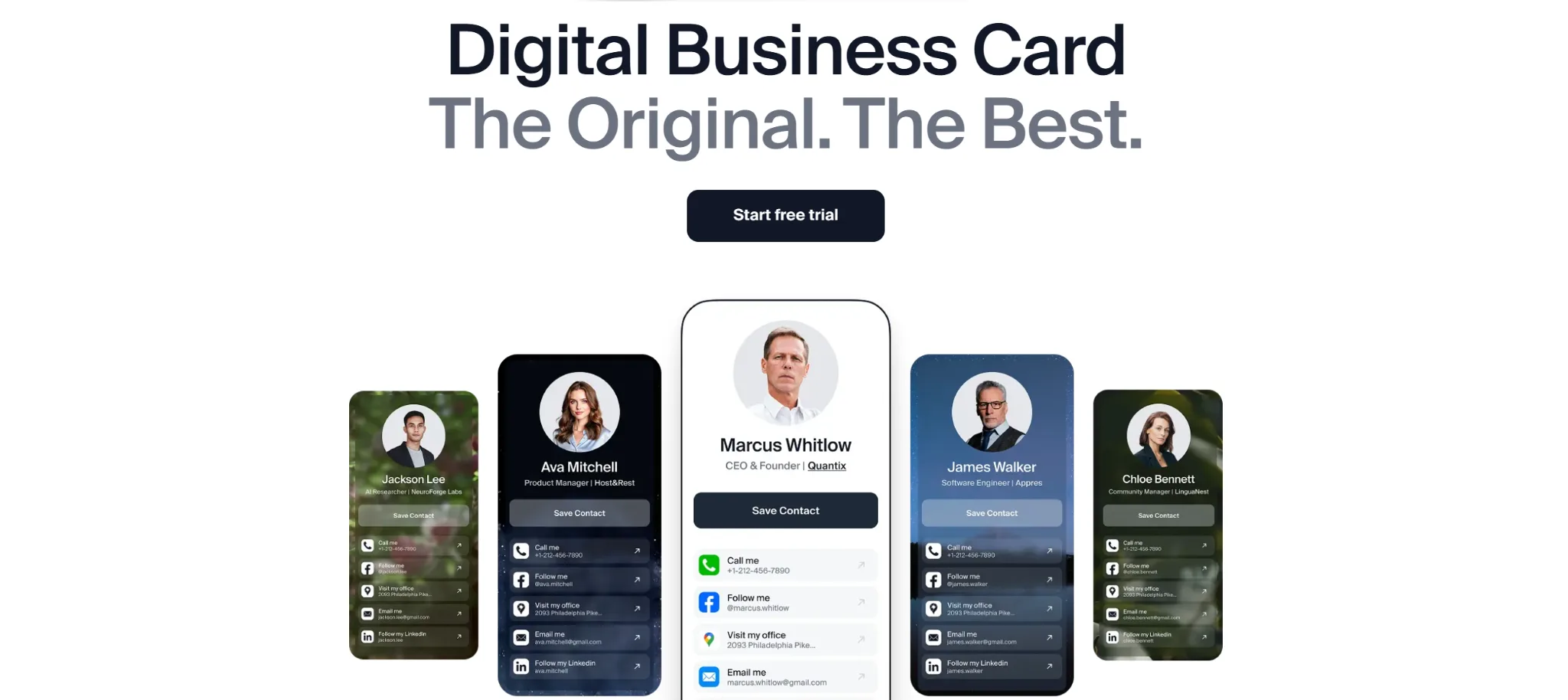
Digital business cards are one of the key gears in today’s networking machine. About 37% of small businesses and 23% of professionals are using digital business cards at events, meetings, and spontaneous networking moments.
And I’m one of them.
Over the past 12 months, I’ve tried 5 different digital business card apps and was a bit amazed by how fast I can build various custom cards and share them in different ways.
In this article, you will find a detailed review of those platforms from a marketing consultant’s point of view, with their pros, cons, best features, and pricing.
By the end, you will have all the insights you need to choose the best digital business card app for your workflow in a natural and practical way.
The Best Digital Business Cards: My Own Rating
It may seem that downloading all those apps, testing them for 10-12 weeks, and making hundreds of notes is truly hard — and yes, it is. But I did it all because I wanted to find a tool with a beautiful design, easy daily use, insightful analytics, and extra features that support my workflow.
And I did it.
To keep this review objective, I used the same testing routine for every app and relied on a clear set of evaluation criteria. I tested each platform on my iPhone 16 Pro Max and MacBook Pro, used the cards during meetings, conferences, and quick networking moments, updating the content regularly to see how the apps handled daily changes.
The evaluation included:
- design flexibility
- ease of setup and daily use
- clarity of the interface
- content structure and supported formats
- performance and loading speed
- sharing channels
- availability and accuracy of analytics
- overall value for the price
This approach helped me test 5 apps and created my personal ranking to choose the best one.
Yeah, I know, I’m a bit meticulous about this stuff 
This review is not sponsored by any of the companies. I paid for all premium plans myself so I could test the full functionality without limitations. The impressions and conclusions are based on my own experience during client work and networking events.
Now I want to share them with you so you can save your time and focus only on the tools that are worth it.
Let’s break them down.
1. DBC: Digital Business Card
I started using DBC: Digital Business Card during client meetings and conferences, and it quickly became my favorite digital card app. It let me build a unique, beautiful, and professionally impressive card that delivers the wow effect I was searching for.
The next huge advantage is their content management. As a marketing consultant who constantly updates links, portfolios, and offers, I need a tool that doesn’t slow me down. DBC lets me edit everything in seconds, and it works more smoothly than any other app I tested.
These are the main reasons I placed them in the 1st place.
Sharing is also a strong side. I could show a QR code, send a link, or let someone save my contact via their phone without needing them to install anything.
The analytics dashboard is quite simple, but it does the job. It doesn’t break down interactions by event or channel yet, but for an individual user like me, those few stats are enough.
 DBC: Digital Business Card Pros
- Big pool of templates: I could choose from 20+ templates to design my cards.
- Easy updates: when my job title or offer changed, one edit and it updated everywhere.
- Multiple sharing methods: QR, link, Apple/Google Wallet support.
- Lead capture form: I can enable it to collect people’s contact information before they receive my card.
- Legit analytics: I could see how many people viewed my card and use this info to make more leads.
- Good value: the pricing is reasonable for what I get.
 DBC: Digital Business Card Cons
- Would love more design options
- Pretty simple analytics
- Some team features are still in progress
- No NFC accessories, widgets, or extra side tools
 Pricing
- They offer a 7-day free trial with no limits, so you can test creating, sharing, and analytics at no cost.
- Premium plan $76/year after the 7-day trial.
My Final Word About DBC: Digital Business Card
DBC ended up being the most balanced choice for my workflow — mainly because of the design options and how fast I can update the content. My first card took about 90 seconds to set up, including adding links, social profiles, and a short bio.
If you’re someone who attends networking events regularly, DBC has a good balance between design, usability, and smart sharing channels.
Additionally, they provide an AI-powered business card scanner that could be useful for conferences or trade shows.
However, the DBC app doesn’t offer extra features like NFC accessories, home-screen widgets, or advanced settings that some competitors experiment with. People who enjoy additional gadgets or some advanced features may notice the difference.
What makes them special is how different it is from every other app in this list. Most platforms look and behave almost the same, but DBC is a new experience that sets your card apart from anything people usually see.
2. Blinq
I started testing Blinq right after DBC, and the first thing I ran into was a registration issue. I tried signing up with Gmail twice, and both attempts showed the same error, so I switched to manual email entry. When I added my email, everything went well, and I could create a password. Not critical, but definitely not the best first impression.
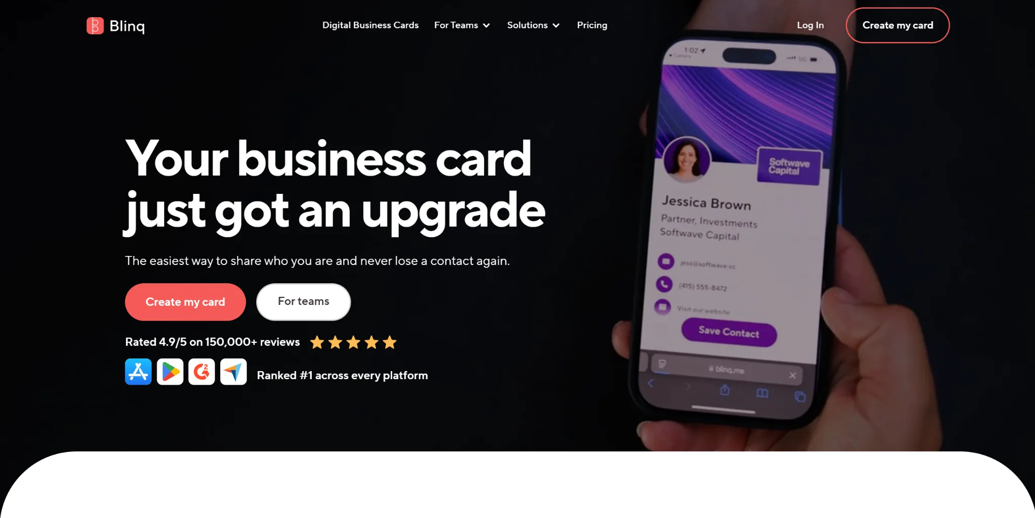
Once I got in, Blinq surprised me with how many features it offers. You can add a widget to your home screen, use your card on Apple Watch, connect NFC, and integrate it with your CRM. There are a lot of tools inside, and I can see how many networkers would find them useful.
But the design… this is where Blinq didn’t impress me at all.
All you can do is change the color scheme and upload a background or logo. The card does not look bad, but very simple compared to the level of visual customization I’m used to after DBC: Digital Business Card.
On the other hand, Blinq absolutely shines when it comes to sharing. At the bottom of every card, there is a large Share button. When you tap it, you can send your card via a message, by email, as a QR code, or as a link in any messenger you use.
Blinq Pros
- Good feature set: widgets, Apple Watch, NFC, and CRM integrations
- Fast sharing: the large Share button makes sending your card very quick
- Simple interface: easy to understand and navigate
- Quick contact setup: adding different contact types takes only a moment
- Stable performance: the app works smoothly during daily use
- Functional focus: great choice if you value tools over design flexibility
Blinq Cons
- You can’t switch between different layout styles
- Only colors and background images can be changed
- The app showed an error when I tried signing up with Gmail
- Hard to make your card look unique
Pricing
Free plan
Blinq gives you a 7-day free trial so you can test the app before paying. You can create up to 2 cards and use the basic features.
Premium plan
Costs $99.99/year (about $8.33/month when billed annually) or $11.99/month if paid monthly.
Premium gives you custom colors, automatically updated contacts, the option to place your logo inside the QR code, the ability to remove Blinq branding, and email your card through Blinq’s servers.
My Final Word About Blinq
Blinq is a great option if you care more about tools, integrations, and functionality than about the visual customization of your card. It has plenty of practical features that can help you during daily networking, and everything inside the app works smoothly.
But for me, the most crucial part of digital cards is strong customization, modern templates, and a polished visual look. That is why I put them in 2nd place in my ranking.
3. HiHello
HiHello looks good at first glance, but when I started adding contact details, the setup felt more complicated than in other apps. Filling out fields takes extra effort because titles automatically copy the URL, and you have to clear it manually. It’s a small thing, but it slows you down and is a bit annoying.
One of the strongest parts of HiHello is the variety of information you can add. The app supports PDFs, payment links, videos, documents, and many additional fields. If you need a digital card that stores a lot of different content, HiHello is the perfect choice.
On the other hand, I found some interface parts overcomplicated. Sharing is split into several screens, takes three to four taps, and some crucial features are placed in menus that are easy to miss. It works, but it does not feel as smooth as Blinq or DBC: Digital Business Card.
Analytics are here, but you can use the full features only in dashboard through the web version. On mobile, you see only a limited part of it, and you still need to open it in the browser. For me, this is not ideal because a digital card should be fast and easy to use directly from the app.
When it comes to design, HiHello stays very basic. The card looks clean, but customization is limited to colors and background images. There are no templates, so it is impossible to create something unique or visually appealing. It feels similar to Blinq in this area, but it is still far away from the level of flexibility I got from DBC: Digital Business Card.
On the positive side, HiHello has a nice onboarding experience with helpful visuals, so you quickly understand the basics of how the app works.
HiHello Pros
- The ability to add many different links: you can add PDFs, payments, documents, videos, and many extra details.
- Professional examples: the HiHello CEO’s own card is available inside the app and helps understand how to make your profile professional.
- Useful badges: place them on your card to highlight skills or certifications.
- Detailed analytics: deeper insights available through the web dashboard. Not suitable for me, but nice for those ready to work cross-platform.
- Good free version: lets you create a card and access basics without paying.
HiHello Cons
- You get access to some features via email confirmation, like analytics. You get a message, open your inbox, click the link, and only then access the page. For me, it’s really annoying.
- The sharing interface is split across multiple screens and feels less convenient than competitors.
- Limited card customization with no layout templates.
- More complex setup flow compared to DBC and Blinq.
Pricing
Free plan
HiHello offers a free version that lets you create a digital card, add contact information, and use basic analytics. It is enough to build a functional card, but some customization options are limited.
Pro plan
The Pro subscription costs $99/year (about $8.25/month, billed annually) or $10/month when paid monthly.
Pro lets you create more cards and unlocks advanced features such as custom colors, access to all design options, detailed analytics, and additional media options.
My Final Word About HiHello
HiHello gives more flexibility in what you can add than most competitors, and the onboarding makes it easy to build your first card.
But after using DBC and Blinq, I felt that HiHello expected me to switch between the app and the browser too often, especially for analytics and some settings. The sharing also felt more complicated than it needed to be, and the customization options are limited compared to what I personally look for in a digital card.
HiHello works well if you want a wide range of fields in your card and don’t mind checking deeper stats through the web dashboard. For me, it was useful to test, but it didn’t fit my daily workflow as smoothly as the other apps.
4. Popl
When I moved on to Popl, the first thing that stood out was how boldly the app pushed me toward subscription plans twice before I even finished creating my card. Not the best start, as I prefer to see what the free version offers before committing.
During onboarding, Popl shows a card preview right away. The problem is that it looks almost empty, and instead of feeling excited, you get the impression that the card isn’t ready yet.
The interface reminds me of HiHello, but some elements feel less polished. Popl does offer example cards of the CEO and a few users, but they don’t look very inspiring from the inside.
One thing I liked immediately was how Popl handles content. All fields are split into categories, and you can add a lot of different types of links and media. Some of these options are available only in the Pro plan, but the overall structure is very organized and easy to use. Among all the apps I tested, Popl has one of the best systems for adding and managing content.
Sharing is also one of Popl’s strengths. The interface works very similarly to Blinq, with the same variety of ways to share your card. It also feels much easier and more comfortable than the sharing flow in HiHello.
Another thing that caught my attention is the “tasks” section inside the app. These small steps help you explore features and make the app feel more engaging. There is also a strong built-in scanner that works with classic paper cards, event badges, and QR codes.
The biggest limitation for me was the lack of analytics. I couldn’t find any analytics tab or dashboard inside the app, and checking statistics through email and browser links is not something I want to do for a tool I use daily. Analytics play an important role in my work, so this was a reason why I put Popl in 4th place.
Popl Pros
- Easy sharing: the sharing flow works almost the same way as in Blinq and gives you many ways to send your card.
- Clear content structure: all fields are organized by categories, so adding links and media is very fast.
- Engaging tasks: the built-in task list helps you explore features and understand the app better.
- Strong scanner: Popl can scan classic business cards, event badges, and QR codes.
- Popl Devices: Popl offers physical items like badges, stickers, bands, and keychains that you can use to instantly share your card without opening the app. It’s a fun and practical addition for events, conferences, and in-person networking.
- Stable app performance: everything works fast during daily use.
Popl Cons
- Aggressive focus on upgrades: the app pushes the subscription offer too early, even before you finish creating your first card.
- Very limited design options: you can only change the theme color, background, and logo. There are no unique templates or layouts like in DBC.
- No built-in analytics: the mobile app doesn’t include an analytics section, which is a significant drawback for professionals like me.
- Some features require switching to email or browser: this breaks the experience and makes daily use less comfortable.
- The first card preview looks unfinished: the preview shown during onboarding feels minimal and doesn’t create a strong first impression.
- Many useful fields are locked behind the Pro plan: a big part of the functionality becomes available only after purchasing subscription.
Pricing
Free plan
Popl lets you create one basic card and try the core features. It is enough to test how the app works, but most tools are locked behind paid plans. Popl gives a two week free trial so you can explore the features before paying.
Pro plan
Costs $2.99 per month or $47.99 per year.
This plan lets you create up to three business cards and capture other people’s contact information. You can also use the paper and digital business card scanner and connect Popl to more than five thousand CRM tools.
Pro Plus plan
Costs $17.99 per month or $174.99 per year with the yearly discount.
You get everything from Pro plus Popl AI, custom lead capture forms, branded push notifications, lifetime analytics, and unlimited device management. You can also create up to five business cards under this plan.
My Final Word About Popl
Popl left a surprisingly good overall impression. The interface is enjoyable to use, the content is organized perfectly, and some additional features give the app a nice boost. If Popl had stronger design customization and built-in mobile analytics, I would consider using it as my main digital card app.
Popl feels like a mix of the best ideas from Blinq and HiHello, shaped into something more user-friendly. But I honestly don’t understand why developers didn’t include analytics in the app, because once they do, Popl could easily compete for the top spot among digital card apps.
If analytics and advanced design are not crucial for you, and you mainly need a simple, intuitive card to share your links, Popl is an excellent choice.
5. Wave
When I started testing Wave, I immediately ran into problems during onboarding. The registration felt unpleasant because it took me three attempts to complete the email field as it kept resetting. Additionally, Wave did not let me skip the Apple Wallet step, which made the process rigid rather than helpful.
Design customization is very limited. All visual settings are locked behind a paid plan, and even after unlocking them, you only get basic options such as changing the theme color, text color, background, and logo. There are no templates or layouts, so I could not make the card unique.
Adding content is split into categories, but the structure does not feel intuitive. The most significant limitation for me was the inability to rename link titles. Every other app in this review allows it, so Wave felt much less flexible in comparison.
Sharing also left a weak impression. Wave offers fewer sharing channels than Blinq, DBC, or Popl, and the flow does not feel smooth.
In design terms, the card looks clean thanks to the social media icons you can tap, but the rest of the layout feels outdated for me.
Wave has almost no extra functionality. There are no unique tools that set the app apart. Analytics do exist, but they are placed inside the settings menu instead of having a visible tab. It is easy to miss them, especially during setup.
After testing all apps on this list, Wave feels the most limited. It works, and the minimalistic card may appeal to users who want something straightforward. But in all key areas, such as customization, content structure, sharing, onboarding, and additional tools, Wave falls behind competitors, so I put them in 5th place.
Wave Pros
- Clean social icons: The social media buttons look neat and help keep the card visually organized.
- Simple card structure: the overall layout is easy to understand without additional setup.
- Basic analytics included: Wave offers analytics in the app, which is helpful for tracking simple card activity.
- Lightweight app experience: Wave runs smoothly and keeps everything very simple, which can appeal to people who prefer minimal tools.
Wave Cons
- Very limited customization: all visual options require a paid plan, and even then, you only get basic color and background changes.
- Weak sharing options: fewer sharing channels than competitors.
Non-intuitive content structure: content categories feel inconvenient, and you cannot rename link titles. - Outdated card layout: the card looks clean, but the overall card feels visually outdated.
- Analytics hidden in settings: the analytics section is placed in the settings menu, so it’s easy to miss.
Pricing
Free plan
Wave lets you create one basic card and use only the most essential features. Customization is heavily restricted, and most visual settings remain locked.
Pro plan
Wave Pro costs $9 per month or $84 per year with a yearly discount.
The upgrade gives you access to custom colors, fonts, and layout options, a branded QR code, CRM integrations, a custom lead form, an unlimited card scanner, and the option to remove Wave branding.
My Final Word About Wave
Wave has strong visual branding, but their digital business card app does not match that level of quality. The registration issues damaged the first impression, and the customization options are very limited. The content editor lacks flexibility, and the sharing experience feels weaker than in other apps I tested.
I think Wave can work for people who want the simplest possible digital card without extra tools. For my daily workflow, it lacks modern design, smooth onboarding, creative features, and a good sharing system.
Top Digital Business Card Apps Table
| Feature | DBC | Blinq | HiHello | Popl | Wave |
| Design Quality |  strongest template selection strongest template selection |
basic colors |
minimal |
basic |
simple |
| Unique Layouts | Yes | No | No | No | No |
| Content Flexibility | High | Medium | Very high | High | Low |
| Sharing Options | Many | Many | Medium | Many | Few |
| Analytics | Basic | Basic | Advanced (web) | None (mobile) | Basic (hidden) |
| Onboarding | Smooth | Mixed | Good | Pushy | Problematic |
| Best For | Professionals who want a strong presentation | Users who want practical tools | Users who need many content types | Simple and intuitive sharing | Minimalists |
| Annual Price | $76 | $99.99 | $99 | $47.99 / $174.99 | $84 |
5 Networking Wins I Wouldn’t Have Achieved Without a Digital Business Card
Now I want to share five examples from my consulting work where a digital business card made a direct impact. These are the moments when fast sharing, good design, and the right features helped me close projects, build stronger connections, or simply earn more money.
- A quick DBC: Digital Business Card scan at WebSummit that turned into a long-term client
At WebSummit in Lisbon, I met David Miller, the founder of BrightPath AI. We crossed paths between sessions and had maybe 20 seconds to exchange contact info.
I opened my DBC card and showed him the QR code. He scanned it and later that evening checked my portfolio through the links on the card. The next morning, he sent me a message on LinkedIn. One week later, we were already planning his new marketing strategy.
That collaboration has now turned into a long-term partnership.
- A Blinq share in the elevator that brought me the biggest project of the quarter
I met Olivia Chen, the COO of RetailFlow, completely by chance in an elevator. We talked for less than a minute, and she asked for my contacts.
I opened Blinq and sent her my card through a simple message. She opened it and saw the two case studies I placed on my website. Two days later, she emailed me asking for a full consultation.
That project brought me a lot of money that quarter.
- A DBC: Digital Business Card card design that won the client before I even presented anything
During a meeting with Eric Johansen, the founder of Nord Design Studio, he asked me to share examples of my landing pages.
I sent him my DBC: Digital Business Card. Later, he told me that the card’s design made him trust my approach before he even reviewed the portfolio. His words were simple. If your card looks like this, I can already imagine how you will handle our brand.
That meeting ended with a signed contract.
- HiHello helped save a contact that normally would have disappeared
At a PR event in Warsaw, I met Sasha Robbins from BlueCom Media. The event was loud and chaotic, and usually, contacts like this get lost. I was testing HiHello at that time and sent her my card directly into our chat.
Two weeks later, she went back to that chat to find someone else and reopened my card by accident. She saw a campaign I recently completed and wrote to me immediately. That message turned into a full project for her agency.
Without a digital card, this connection would not have survived the event.
- A fast DBC: Digital Business Card share on a call helped me win a project over two competitors
During a video call with Marcus Levin, the CEO of FinGrowth Labs, he asked for links to my recent work. He only had a few minutes left before another meeting.
I sent him my DBC: Digital Business Card right in the call chat. He opened it instantly and told me that this made the decision easier because he did not need to wait for separate emails.
Later, he said that I was the only one who provided everything on the spot. That moment helped me secure the contract.
Final Word
After spending months testing these apps, I can confidently say that a digital business card is no longer a nice thing to have. For a modern professional, it’s a personal website you always carry in your pocket.
Ignoring it today is like ignoring LinkedIn ten years ago.
I enjoyed comparing different tools and seeing how each company approaches design, content structure, analytics, and sharing options. Some apps focus on functionality, some focus on simplicity, and a few try to combine everything in one place.
For my workflow, DBC ended up being the most natural and consistent choice — the one I keep returning to because it simply works the way I need it to.
If you want to network more easily, look more professional, and share your information in seconds, digital business card apps are the best place to start in 2026. They cost less than printed cards and give you far more opportunities in return. Good luck with your sharing, and feel free to test 2–3 apps to see which interface best matches your workflow!